Last month, we chatted about putting together your first academic CV. So now what?
Formatting, of course! All that fun stuff like margin sizes, san serif vs. serif fonts, how far to indent, left justifying columns… such fun! Karen Kelskey over at The Professor Is In has a fairly comprehensive blog post on formatting your CV. While I don’t agree with everything she says, I think it’s a great place to start.
So rather than reinvent the wheel, I decided to pull up my own first academic CV and workshop it, showing the before and after.
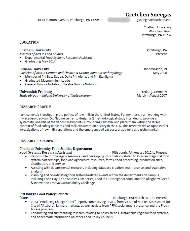

In terms of content, this draft includes several of the sections I mentioned in part one of this series. I have a heading with my name and contact info, educational history, evidence of both research and service activity, and references. I had no teaching experience at that point so nothing to include there. It feels a little skimpy at only two pages, but I hadn’t even finished my Masters, so it’s probably fairly similar to other early-career students. So far so good.
However, there are lots of ways to improve this document. Here are a few:
1. Make it look more like a CV and less like a resume
When I look at this CV, it looks to me more like a resume – not just because it’s only two pages long, but how I have formatted and organized the text on the page. (Also – no surprise here – I basically used my resume at the time as a template for my first CV.)
Some ways to make this document look less resume-like:
- Changing the heading: center-justify my name, make it only 14-point font, and remove the line separating the name from the contact information.
- Remove bullet points: I have never seen these on academic CVs. More commonly, I see researchers create a timeline in reverse chronology, with dates in a column on the left, and the description of the activity to the right. For longer descriptions, a sentence or two underneath the heading with a hanging indent could also suffice.
- Separate publications and presentations into separate sections: You can make an argument for keeping these together because, at this stage in my academic career, I didn’t have very many publications or presentations. However, I would make each its own section. They are fundamentally different forms of research activity. However, I would wait to separate out different kinds of publications/presentations until there are more of them.
2. Consider the story you are telling with your CV
Imagine a harried professor with a stack of CVs they need to read. Chances are, only the first page of that CV will receive much attention.
The first page of your CV is prime real estate, and you want to maximize it. Have a publication? Make sure it is on the first page. Any impressive awards or funding? First page. As you begin populating your CV with more items, chances are you will only have one section (or part of a section) that fits on your first page – but you should lead with whatever the conference/job search/etc committee will find most impressive.
For this document, here’s the advice I would give my 2013-era self:
- Remove unnecessary white space and/or text: See that white space to the left of the address at the top of page one? That, my friends, is dead space that can be axed. Likewise, my education section is taking up much more room than it needs. I’d remove the institutional address completely, and re-write the education section to maximize space.
- Move publications and/or awards to the first page: Unless I’m submitting this CV to a position where my research experience at Chatham University and the Pittsburgh Food Policy Council will be extremely compelling, it probably makes more sense to highlight that I have a publication under review, and my academic awards. These are far more compelling – and more likely to be recognized as – pieces of evidence that I produce high-quality scholarship.
- Remove “padding” for length: It’s tempting to add extra items to increase our CVs by an extra line or three, especially early on when we don’t have much. Resist this urge! It is much more compelling to see a shorter CV with high quality examples of research, teaching, and service activity than to see a longer CV with unnecessary fluff. To that end, I would remove the “Research Profile” section and, if so desired, replace it with a “Research Interests” section that has a line or two of keywords signposting my area(s) of scholarship.
3. Make the document look clean, professional, and standardized
Maybe I’m a stickler, but nothing turns me off more quickly than a sloppy-looking CV. Even if your CV is on the shorter side, you want it to look professional. This is where formatting really comes into play.
Some suggestions for this document:
- Pick a serif or sans-serif font and stick with it: Personally, I prefer CVs to have a single font throughout, with headings emphasized with a larger font size, italics, underlining, and/or bolding. You can get away with having two different fonts – one for headings, and one for body text – but please for the love of Pete do not mix serif (e.g. Times New Roman, Garamond) and sans-serif (e.g. Calibri, Helvetica, Arial) fonts! It looks very sloppy and unprofessional, as you can see in my example – I have a serif font (Georgia) for my headings and a sans-serif font (Calibri) for the body. *shudder.* EDIT: This is largely an aesthetic preference on my part. For example, in journalism it is common to mix serif and sans-serif fonts between headings and bodies of text. So, feel free to ignore this piece of advice if you prefer.
- Keep formatting consistent between sections: If you look at my example, I have some sections formatted with bullet points, some with text blocks, and some with citations. The justifications are different between sections (e.g. my education section has a different right-hand margin than the sections above or below). I organize the dates and places differently for the education section than for my research experience section. These might seem like small details, but picking one way to format these sections, and keeping it consistent across the document, goes a long way towards making the whole thing look clean and professional.
So what would my 2013-era CV look like if I made all these changes? Behold:
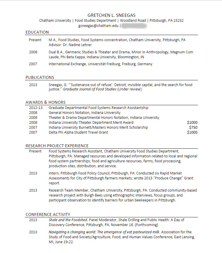
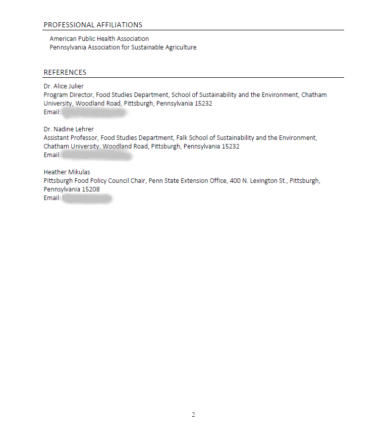
What do you think? The revised document is shorter, I will give you that. However, now I actually fit a good deal of the relevant information on the first page. So if I were applying for a PhD program, a conference, or an internship, I would know that the reviewers could see all the most pertinent information at a glance.
And although the revised CV is shorter, my impression is that it looks far more professional. When I compare the two documents, I am far more struck by the appearance and organization of the newer version than the old. Let me know what you think on Twitter!
This concludes part two of my academic C.V. series! Stay tuned for part three, which will discuss how to use your C.V. as a tool for long-term planning and time management.
If you have any questions, comments or suggestions for this or future blog posts, you can email me (gsneegas@tamu.edu) or find me on Twitter (@GretchenSneegas). Looking forward to hearing from you!

Leave a comment